


Week 36, 2015: UK Trade Balance
Summary: UK trade figures out this morning showed that despite a poor month of trading in July, the trade deficit almost halved between the quarter to April and the quarter to July (from £8.9bn to £4.7bn) after a strong summer for UK trade generally. This week's chart looks at the contributions to the UK trade balance since 1998.
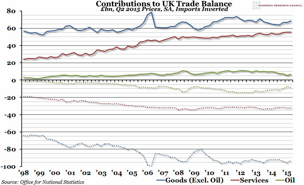
What does the chart show? The chart shows the total quarterly value of all exports and imports in billions of pounds, adjusted for inflation (in today's prices) and seasonally adjusted. Exports of services, oil, and other goods excluding oil are shown by the solid red, green and blue lines respectively. Imports have been inverted, because they count as a negative influence on the trade balance, and are shown by the dotted lines of the equivalent colour.
Why is the chart interesting? The UK's trade deficit in the three months to July (£4.7bn) was considerably lower than both the three months to April (when it was £8.9bn) and the three months to July 2014 (£10.7bn). In fact, this summer represents the lowest it has been on a quarterly basis since 2011 (and before that, it hasn't been this low since 2000). As you can see from this week's chart, this has mostly been caused by our trade in goods. After the financial crisis in 2008, our exports of goods grew from £60bn per quarter to almost £75bn per quarter, but between 2011 and 2014 they fell back to under £65bn per quarter. However, in the last year, they have been growing steadily in value again, while imports have stayed relatively flat (although a slight decrease in the last quarter contributed to the overal deficit falling). Meanwhile, our trade surplus in services has been fairly flat for the past year, while our trade in oil (which we, perhaps oddly, both export and import in roughly equal measures) is currently at the lowest deficit it has been for over a year.
 Post a Comment