


Week 23, 2013: UK Historical Work Sectors
Summary: The Office for National Statistics published a fascinating report this week analysing census data going back 170 years and pointing out the rise and fall of different industries within the UK. We take a look at one of the graphs in greater detail.
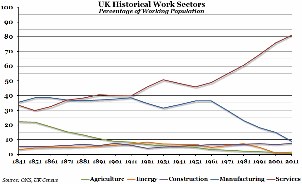
What does the chart show? The chart shows the percentage of the total working population employed in each sector in every census year going back to 1841. From 1841 to 1911 this is for the whole of the UK; after 1911, it is just for England and Wales. The numbers for 1941 and 1971 are estimates, since there was no census taken in the former, and the industrial groups were different for the 1971 census.
Why is the chart interesting? The most obvious thing to point out is the explosion of the service sector since the 1950s (the earlier bump between 1911 and 1921 might be due to limiting the data to England and Wales for the first time in 1921), largely at the expense of the manufacturing sector which had remained fairly consistent for at least 120 years before that point. The UK's reliance on the service sector is well reported, and this graph shows that in 2011 more than 80% of the working population of England and Wales was employed in that sector, compared to just 40% at the beginning of the 20th century.
However, two other things are interesting as well. The first is that the proportion of construction workers has barely changed at all over the past 170 years - a remarkable feat for any statistic over that length of time - and the second is that the proportion of workers employed in agriculture has collapsed from over 20% in 1841 to less than 1% in 2011.
 Post a Comment