


Week 29, 2012: Crime and the Economy
Summary: Crime figures released yesterday by the Office for National Statistics show that total crime in the UK decreased again for the 9th consecutive year, flying in the face of fears that the relatively high unemployment rate might cause it to rise.
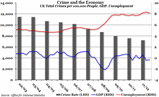
What does the chart show? The grey bars show the total number of reported criminal offences in the UK per 100,000 of the population in each financial year, measured against the left hand axis. The blue line shows the quarterly percentage change in Gross Domestic Product, and the red line shows the quarterly unemployment rate for everyone aged between 16 and 64, both measured against the right hand axis.
Why is the chart interesting? Despite the severe rise in unemployment as a result of the recession in 2008, crime rates have continued to fall. This goes against popular wisdom, mainly based on the experience of the 1980s, that crime increases when unemployment is high. Even the category of "Property Crime Offences", the main division of crime that one might expect to increase, is falling. And although it should be noted that some specific crimes are becoming more prevalent, such as metal theft, these may be attributable to other causes (high scrap metal prices, for example).
 Post a Comment