


Week 51, 2012: Charts of the Week

Summary: As we did at the end of 2011, we've taken a look back at the most popular Charts of the Week of 2012.
What does the chart show? The chart shows the top twenty most popular Charts of the Week of 2012, scored according to a complicated formula which takes into account popularity on social media sites, popularity on the ERC website, and popularity in the ERC office.
Why is the chart interesting? 2012 has been the first full year of Charts of the Week, so there are plenty to choose from when considering your favourite. Our (possibly unscientific) Popularity Index seems to favour recent charts over older ones, with almost all of the top twenty coming from the second half of the year (the oldest chart included is from Week 17). We suspect this is caused by the "popularity in the ERC office" portion of the index, with anything pre-Olympics seeming like a distant memory. That said, the winner was very popular both on social media and our website, and deserves its place at number one.
These are the top twenty:
| 20th | 19th |
Week 23, At Risk of Poverty Rates 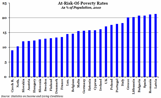 |
Week 40, Labour Productivity  |
| 18th | 17th |
Week 45, Housing Affordability  |
Week 42, Employment Rate  |
| 16th | 15th |
Week 26, Public Sector Net Debt  |
Week 43, Average Pensioner Income  |
| 14th | 13th |
Week 39, Credit Availability  |
Week 34, UK Budget Surplus/Deficit  |
| 12th | 11th |
Week 17, History of UK Recessions  |
Week 41, The Cost of Borrowing  |
| 10th | 9th |
Week 32, Olympic Medals 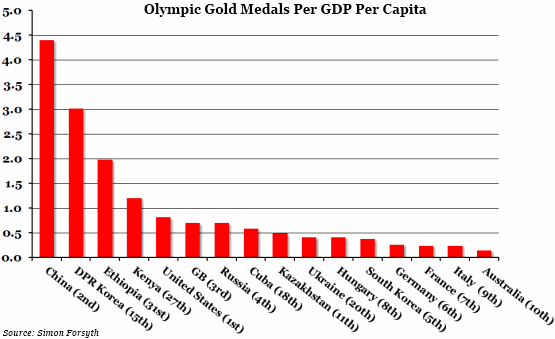 |
Week 28, Public Sector Debt Forecasts  |
| 8th | 7th |
Week 37, Government Spending on R&D  |
Week 35, Workless Households  |
| 6th | 5th |
Week 29, Crime and the Economy 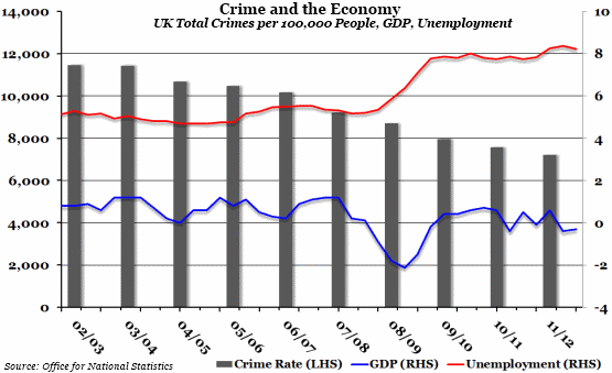 |
Week 49, Average Household Finances  |
| 4th | |
Week 44, Relative GDP Recovery |
|
| 3rd | |
Week 48, Clash of the Titans |
|
| 2nd | |
Week 47, Government Finances |
|
| 1st | |
Week 50, Regional Education Levels |
|
 Post a Comment
