


Week 45, 2014: EU At-Risk-of-Poverty Rates
Summary: The European Commission released their annual data on poverty rates in the EU this week. The United Kingdom is one of only a few countries to experience a significant improvement in the at-risk-of-poverty rate over the last five years.
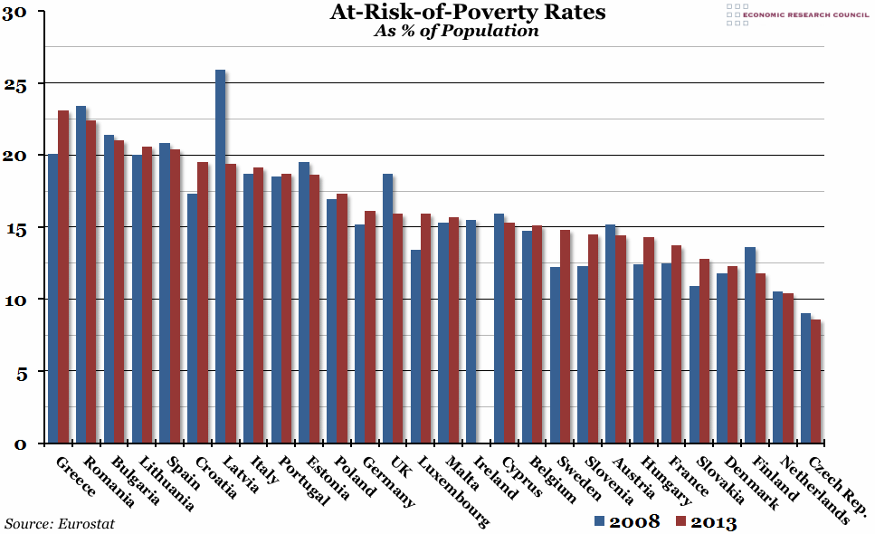
What does the chart show? The chart shows the at-risk-of-poverty rate for all 28 European Union countries in 2008 (the blue line) and in 2013 (the red line), with the exception of Ireland, for which 2013 data is not yet available. The at-risk-of-poverty rate is defined as the percentage of the total population with an income (after social transfers such as income support, etc.) lower than the threshold of 60% of the national median disposable income. This definition of the poverty rate is therefore relative to each country; the threshold that determines "poverty" differs according to the average income. This means that the poverty rate is more accurately a measure of inequality within each country, and not an absolute measure of living standards.
Why is the chart interesting? For most countries in the EU, their poverty rates have worsened since 2008. The EU28 aggregate figure rose from 16.6% to 16.7% over that period. However, for a few countries, there have been significant improvements; Latvia, which had the worst poverty rate as recently as 2010, has seen their rate fall from 25.9% to 19.4%. The UK has experienced the second best improvement in the EU since 2008, and while we are still in the top half of the list, the poverty rate is no longer quite so alarmingly high. At the other end of the scale, Greece has suffered an increase in their poverty rate, pushing them to the top of the list, while many countries which were previously at very low risk (such as Sweden, Slovenia and Hungary) have seen a serious increase in their poverty rates over the period.
 Post a Comment