


Week 50: US Trade in Goods with China
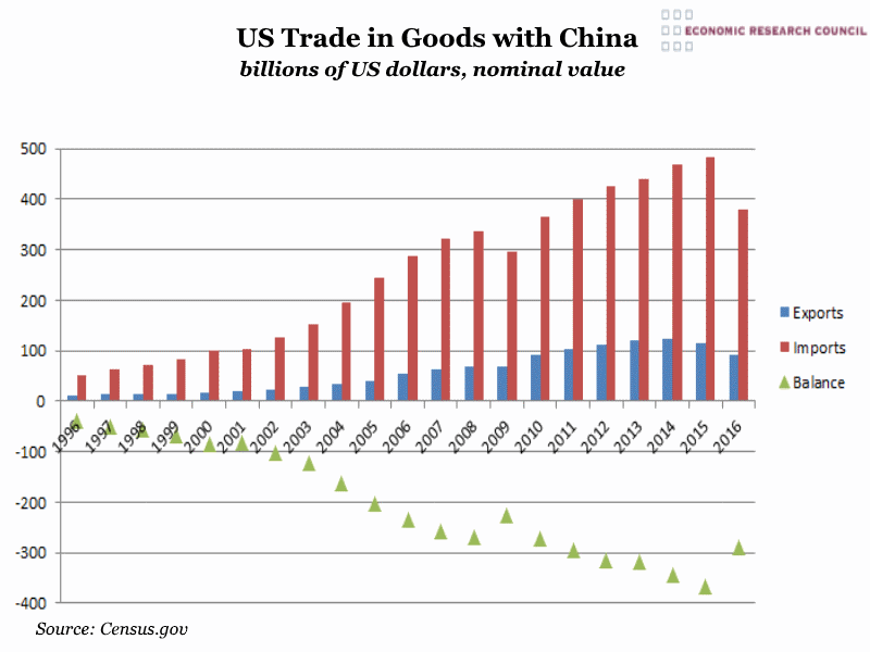
Summary: The chart demonstrates the extent to which the two countries’ economies are intertwined and the enormity of the US trade deficit with China, which has only increased in the last two decades. With Trump’s anti-China rhetoric on the campaign trail, threats to impose a 45% tariff on all Chinese goods and recent controversial communications with Taiwan; this relationship appears on shakier ground.
What does the chart show? The blue bars on the chart show US exports to China, and the red bars show imports from China to the USA. The green triangles show the balance of these two numbers. All the data is in billions of US dollars and represents only trade in goods. The data begins in January 1996 and runs until October 2016. The value of the dollar is nominal and the data is not seasonally adjusted.
Why is the chart interesting? The chart shows that the US trade deficit with China has very significantly grown in the last 20 years. 2005 reform of the Chinese currency policy (making the renminbi rate adjustable) has been blamed by some in the US for causing the trade deficit to widen further, which can to some extent be seen on the chart. In 2009 there is a dip in the volume of imports from China and a stall in the growth of exports, resulting from the global economic crash.
In 2007 China became the US principal source of imports, sending 19% of all the goods arriving in the US. By comparison, Mexican imports constituted only 14% that year. In 2009 China was the third largest recipient of US goods, buying 6.6% of all goods exported from the US. Historically China sent low value and labour intensive goods to the US but has recently become the largest supplier of computer equipment (53.6% of total US imports in this category in 2008). Historically, the US’s largest export to China was waste and scrap but in recent years this has changed as China’s per capita GDP has risen and their consumers have a greater appetite for imported western goods. According to Bloomberg, per capita GDP in 1996 was $706 in China and 42.5 times higher than that in the USA. By 2014, Chinese GDP per capita had risen to $7,626, with the US being only 7.1 times as high. In 2005 the value of Chinese exports overtook US exports and 2010 marked the year that Chinese trade with the world surpassed the US’.
Following Trump’s election, there has been much talk of a ‘trade war’ with China, something not in either countries’ interest. The imposition of the threatened high tariffs on Chinese goods would likely be met with a similar retaliation on US exports to China.
What the chart shows however, is that this would have a more significant and adverse effect on Chinese exporters and US exporters would suffer to a lesser extent. However the chart shows that due to the volume of imports from China to the US, US consumers, with their far greater reliance on Chinese goods, would stand to suffer on a far larger scale than Chinese consumers. US consumers would likely face significant price increases on many indispensable goods.
However, should there be increased tariffs on Chinese goods entering the US, it is likely that consumer demand would remain the same, potentially engendering greater competitiveness within US-based industries.
 Post a Comment