


Week 28, 2014: UK Wage Differences
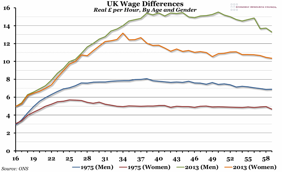
Summary: At the end of last week, the ONS released a report on how wages have changed over time, particularly for three cohorts born in 1954, 1964 and 1974. There are plenty of good charts in the report, but one of the most interesting is this one, on how the gender wage gap has changed between 1975 and 2013.
What does the chart show? The graph shows average hourly wages, in pounds, for men and women of different ages in 2013 and 1975 (age is measured on the x-axis). The blue and red lines are for men and women respectively in 1975, and the green and orange lines are for men and women in 2013. The 1975 wages have been adjusted to account for inflation, so they are directly comparable to the 2013 numbers.
Why is the chart interesting? First, this graph shows the real wage growth between 1975 and 2013, particularly for those later in their careers. A man in his 40s today earns double what he would have earned in 1975, and a woman in her 40s earns more than double.
Second, and more interestingly, the graph shows how the wage gap between men and women has changed since 1975, when the Sex Discrimination Act was passed. In 1975, from the age of 18 onwards, there was a clear gap in wages. Today, the story is much more complicated. Up to the age of 27, there is almost no difference in the average wage for men or women. A small gap then opens up between the ages of 27 and 34 (starting with the group of women aged 28, who currently earn less on average than their 27 year old colleagues), before the gap really widens for those in their mid-30s onwards. Why is it that there is no wage gap for those in their 20s, but for men and women in their 40s onwards there is a larger gap than there was in 1975?
There are basically three reasons for gender wage gaps: outright discrimination (two people doing exactly the same job getting paid a different amount), career choices (some types of jobs pay better than others), and part-time work (part-time workers tend to get paid less than full-time workers, particularly in the latter stages of a career, and women often choose (or are forced into) part-time work to fit around raising a family). Assuming that outright discrimination has now been largely eliminated, there are two remaining explanations for the graph above. Is it showing a generational shift, where women who are currently in their 20s have found it easier to enter high-paying industries which have been historically male-dominated (in which case, we'd expect this same graph in 10 years time to show no wage gap for people in their 30s as the current cohort gets older)? Or is it because as more women in their 30s begin to start families, they tend to prefer (lower-paid) part-time work to fit around raising children?
The fact that the average age for a woman in the UK to have her first child is 27.9 suggests that it may be a combination of the two: the small gap that opens up between 27 and 35 could be child-related, while the larger gap from 35 onwards may be generational.
 Post a Comment