


Week 14, 2014: Cost of Essentials
Summary: After last week's chart on wages compared to inflation, we received plenty of correspondence asking whether CPI is the best measure for the cost of living. In response, we've tried to isolate the price changes for the bare essentials, to see how they compare to the overall CPI.
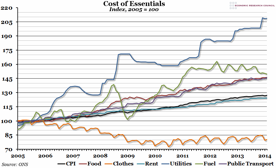
What does the chart show? The various lines on the chart show the price index for a number of different elements of the overall CPI measure of inflation, with 2005 as the base year. Most of the categories are self-explanatory; "utilities" is a weighted measure of water, gas and electricity (using official CPI weights), and "public transport" includes both rail and road (weighted equally).
Why is the chart interesting? Any attempt to isolate the "essentials" meets an immediate problem of subjectivity. The weighting system used in the CPI represents a fairly good measure of overall price changes, but includes plenty of items that would be considered non-essential. Here, we've tried to reduce it to the very basics: food, clothing, housing (with associated utility costs), and a way to get to work (whether that includes fuel for your car, or public transport).
Most of these essential items have experienced higher inflation than the official CPI. The cost of utilities, for example, has more than doubled since 2005, while fuel, public transport and food have all increased by 50%. Over the same period, official inflation has been more like 25%. In contrast, the cost of clothing has actually decreased since 2005 (and has been falling since well before that), while rents have largely followed official inflation. However, it has only really been utility bills that have been rising consistently above inflation since 2010 (although food and public transport costs have been growing very slightly faster than the CPI).
In fact, if you were to take these "essentials", give them the same weights as they are given by the CPI measure, and look at year-on-year growth, this "basics" inflation would have peaked at 12% in 2008 (compared to 5.2% CPI growth), and then more recently at 8% at the end of 2011 (compared to 5% CPI growth). The most recent peak would have been 4.3% in July last year (compared to 2.7%), but last month it would have fallen to 1.9% - barely above the official rate.
 Post a Comment