


Week 15, 2017: UK Voter Sentiment on Key Issues
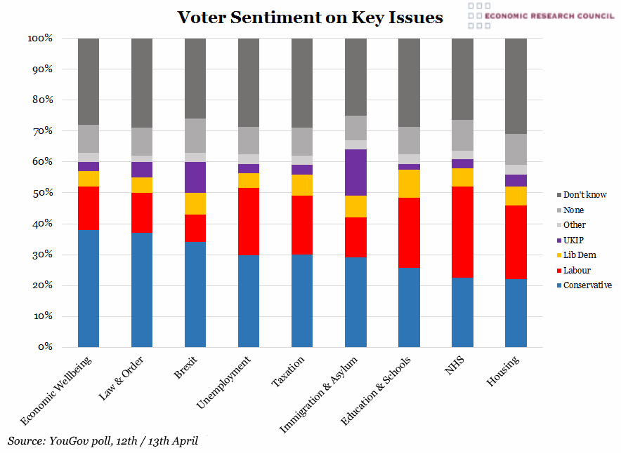
Summary: The chart shows that the Conservative Party enjoys the majority of support across 7 of 9 issues, with Labour support exceeding the Tories’ only on NHS and Housing. Echoing this pattern, when questioned on their preference Theresa May was chosen by 50% of the sample as the best Prime Minister, and Jeremy Corbyn only 14%. Those that opted for ‘Other’, ‘None’ and ‘Don’t Know’ consistently make up around 40% of votes; they are represented by the various grey sections. This uncertainty was lowest on the topic of immigration and asylum, where the conclusive party preferences made up 67% of the total. Unsurprisingly, UKIP secures its highest support (15% of votes) on Immigration and Asylum, coming in second only to the Conservatives at 29%. Education and schools draw up a close run between Conservative and Labour at 26% and 23% respectively, suggesting perhaps that the electorate isn’t decided on the issue of grammar school expansion. UKIP trails in the area of education with its lowest share of 2%. Interestingly, housing is where the largest proportion of those polled are undecided, a significantly greater number than those favouring the leading party in this area, Labour. The chart shows economic wellbeing to be Conservative’s strongest area, which may reflect both the ability to unify the party on messaging in this area and the relative calm so far following the turbulence anticipated in the wake of Brexit. On handling Britain’s exit from the EU, UKIP support exceeds Labour by 1%, but trust in the Conservatives is nearly four times as high. In the area of law & order, a traditionally Tory strong suit, almost triple the votes are in favour of the Conservatives compared to Labour. Unemployment is one of the Liberal Democrat’s weakest areas with only 5% support, one sixth of the Conservative support. Although 34% of people polled believed that leaving the EU will be bad for UK jobs, this did not translate to greater support in this area for the Lib Dems, despite their overt preference for a softer Brexit. The category of taxation generally shows a similar pattern as unemployment, but Lib Dems manage to secure slightly more trust at the expense of Labour.
What does the chart show? The chart shows the results of an opinion poll on 12th/13th April. A representative sample of 2,069 respondents (who voted Leave and Remain proportionally), drawn and weighted across the UK, were asked which of the parties they would favour on a number of key issues. Each bar is split into sections represented by each Party’s traditional colours; Conservative in blue, Labour in red, Lib Dems in yellow, UKIP in purple. The data displayed is from a YouGov opinion poll. Following the erroneous polling results during the previous general election and in the US 2016 election, caution must be exercised with this type of data.
Why is the chart interesting? The high proportion of undecided voters may encourage tactical voting efforts, such as the formal campaign launched by Gina Miller which is focussed on encouraging the tactical support of europhile MPs regardless of party affiliation. Following the announcement of the snap-election, there was initial mention of the prospect of what Mrs May terms a ‘coalition of chaos’; a potential alliance between Labour, Lib Dem and SNP. Despite the rejection of this idea by both Labour and the Lib Dems, the chart shows that even when the sum of all Lib Dem, Labour and ‘other’ support is compared to the Conservatives, this coalition would secure overall support in only 4 out of the 9 categories, and not necessarily the categories which voters may choose to prioritise.
 Post a Comment