


Friday
Mar092012
Week 10, 2012: UK Production Output
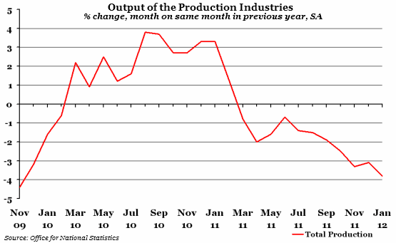
What does the chart show? The chart shows the percentage change in the output of the production industries compared to the same month in the previous year. The broad category of "production industries" includes mining, manufacturing, utilities, and oil and gas extraction.
Why is the chart interesting? Output has been lower than the previous year for almost a full year now, and doesn't appear to be recovering. The January figure was the biggest drop since November 2009. This all appears to be bad news, but masks the fact that most of the decrease comes from the mining and energy sectors, with the bigger manufacturing sector actually increasing output by 0.3%. This is not large growth, but it is positive nevertheless.
 Post a Comment