


Week 38, 2014: UK Trade Balance
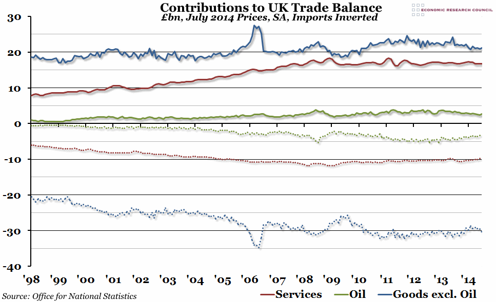
Summary: Last week it was reported that the UK's balance of trade deficit increased to an estimated £3.3bn in July, compared to £2.4bn the previous month. In this week's chart, we take a look at the main components of trade.
What does the chart show? The chart shows the total value of all exports and imports in billions of pounds, adjusted for inflation (so prices are equivalent to July 2014 prices) and seasonally adjusted. Exports of services, oil, and other goods excluding oil are shown by the solid red, green and blue lines respectively. Imports have been inverted, because they count as a negative influence on the trade balance, and are shown by the dotted lines of the equivalent colour.
Why is the chart interesting? The latest spike in the trade deficit has been caused largely by an increase in the value of imports of goods (excluding oil), and this is representative of what has happened to the UK's trade balance in general over the past sixteen years (and beyond). If you exclude the exceptional case of oil, which we (slightly bizarrely) both import and export in almost equal measures, the export of goods has fluctuated around £20bn in today's money since at least 1998. In the aftermath of the financial crisis, it did initially seem as if we were exporting more goods, but exports have since fallen in value back to the £20bn mark. However, the value of our imported goods has increased in real terms from around £20bn in 1998 to £30bn today, leaving us with a £10bn deficit to fill. The services industry has managed to fairly consistently produce a trade surplus of around £6bn to £7bn since 2008, which has helped to plug the gap somewhat, but it hasn't been enough.
 Post a Comment