


Week 51, 2016: Number of JSA Claimants v.s. Total Welfare Spending
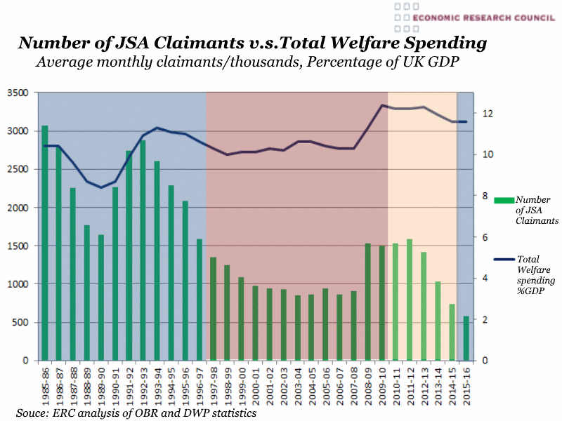
Summary: The chart demonstrates the variation in welfare spending under each successive UK government. Overall the chart shows a trend of decreasing number or JSA claimants, with spikes in periods of recession. This is loosely tracked by overall welfare spending except during the period of Labour rule between 1997 and 2010.
What does the chart show? The black line represents total government spending on welfare as a percentage of GDP. This represents the total welfare bill including pensions, child tax credits and Job Seekers Allowance. The green bars show the average monthly number of Job Seekers Allowance claimants in thousands. The areas with blue background denote periods of Conservative government, red denotes Labour government and the orange are represents the 5 years during which the UK was ruled by the coalition of Conservatives and Liberal Democrats. For the years prior to the creation of Job Seekers Allowance, the ONS has estimated the number of eligible individuals.
Why is the chart interesting? The chart shows that, contrary to what one might expect, there is no consistent pattern of increased welfare spending prior to elections, with the exception of the last couple of years under Gordon Brown. This coincided, however, with the global financial crisis, causing a contraction in GDP and increased joblessness, which can be seen in the sharp rise in the percentage of GDP spent on benefits. The overall correlation between number of claimants of Job Seekers Allowance and the total welfare spend ceases during Labour rule, however there are several factors that influence this. Tony Blair’s welfare reforms reclassified a large proportion of JSA claimants onto other newly-created benefits such as Employment Support Allowance, a payment for those deemed ‘moderately’ impaired in their ability to find work due to illness or disability. Also demographic changes influenced the number of JSA claimants, particularly the WW2 ‘baby boomers’ moving onto state pensions rather than working benefits.
The single biggest factor in this however is our aging population and the resultant increasing pension bill, which is included in the total welfare spend and explains its apparent increase despite overall increase in employment.
 Post a Comment