


Week 25, 2013: UK Tourism
Summary: New tourism data released this week revealed that tourism so far for 2013 looks to be up by about 1% on last year. Last summer we produced a weekly chart on tourism in England, and asked what effect the Olympics would have after a report suggested they would bring in an extra 10.8 million tourists over 12 years. We can now update that chart with the 2012 data.
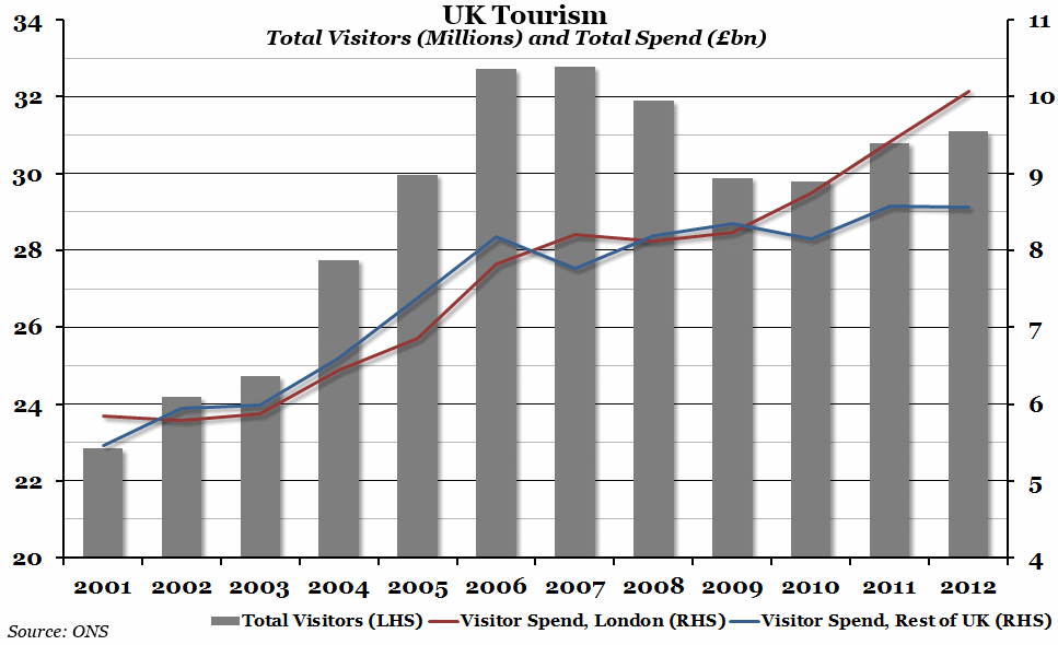
What does the chart show? The grey bars in the above chart show the total number of visitors to the UK (not England, as last year's chart showed) each year, in millions, measured against the left hand axis. The two lines represent the total amount spent by visitors to London (in red) and the rest of the UK (in blue) each year in billions of pounds (measured against the right hand axis). This is in current prices (so does not take inflation into account).
Why is the chart interesting? In 2012, total visits to the UK increased by only around 287,000 people compared to the previous year; this is actually one of the smallest increases in the past decade, and certainly not what one might expect as a result of the London Olympics. Furthermore, while they spent an extra £663 million in London, tourists spent £21 million less in the rest of the UK in 2012. This widened the gap between tourism income in London and the rest of the UK that has been growing since 2009.
 Post a Comment