


Friday
Jun102011
Week 23, 2011: UK Trade Balance
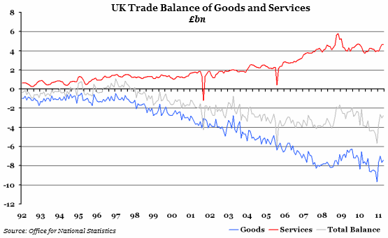
What does the chart show? The balance of trade is the difference between total exports and total imports - or net exports. A negative number therefore means that more has been imported than exported, and vice versa. The red line shows the trade balance for services, while the blue line shows the same for goods. The grey line is the total balance of trade, which is an amalgamation of the two.
Why is the chart interesting? The balance of trade can be an important element in restarting an economy, as high exports stimulate domestic growth. On the other hand, high imports reflect high domestic demand, which can be a positive sign for producers in this country as well as abroad. This month saw a consolidation of the improved position over the past quarter. Although the balance of services declined very slightly (exports fell by £0.1bn, while imports increased by £0.2bn), the balance of trade in goods improved by more. This is good news for an economy generally considered to rely too heavily on the service sector.
 Post a Comment