


Friday
Mar022012
Week 9, 2012: US GDP & Core Orders
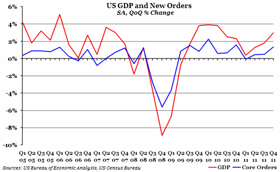
What does the chart show? The red line represents the percentage change of seasonally-adjusted gross domestic product (GDP) on the previous quarter - the standard measure of the growth of an economy. The blue line represents the percentage change of seasonally adjusted new orders of "core" goods (all durable goods excluding transportation, since orders for goods related to transport tend to fluctuate a great deal), averaged over the quarter.
Why is the chart interesting? US GDP growth seems to be healthy at the moment, with growth in the final quarter of 2011 upgraded from 2.8% to 3% this week. Compared to the UK, where growth is basically non-existent, this looks particularly impressive. It also continues the trend of increasing growth throughout 2011.
However, it is not all good news. Data released by the US Census Bureau on new orders in January 2012 suggested that they have dropped by 3.29% (this is not yet represented in the chart above, since it counts towards Q1 2012). If orders don't recover this quarter, GDP growth will be nowhere near 3% for Q1 2012.
 Post a Comment