


Week 41, 2015: Historical Real Average Salary
Summary: According to data released this morning, earnings growth remained strong in the three months to August at 2.8% in nominal terms. This is a continuation of a strong year of earnings recovery, hopefully putting an end to the worst slump in real earnings since at least 1855.
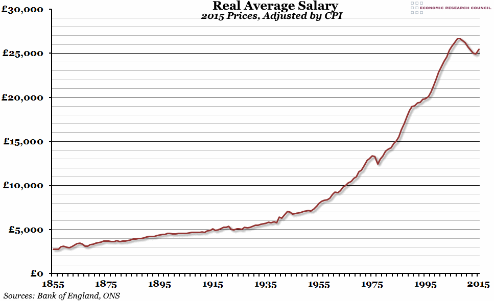
What does the chart show? The chart shows the UK average annual earnings since 1855, adjusted by the Consumer Price Index to reflect 2015 prices. Up to 2009 this is based on the Average Earnings Index compiled by the Bank of England from a number of different sources. After 2009, we have used the Office for National Statistics' data on Average Weekly Earnings. The figure for 2015 is an estimation based on the 8 months of data up to August that we have so far.
Why is the chart interesting? Last year we reported that the 2007-2014 fall in real earnings was the worst since records began. Thankfully, 2015 has so far seen a remarkable turnaround in earnings growth, with real average earnings forecast to grow by more than 2% year-on-year. This would be the fastest growth since 2004, and well above the 160 year average of 1.4% (although below the average growth rate between 1975 and 2007). At this rate, earnings would surpass the previous peak in 2018 in real terms.
However, the current rapid real growth rate is partly due to the very low rate of inflation that the UK (and most other advanced economies) is experiencing. When inflation rates return to more normal levels, nominal earnings growth rates will also have to rise to maintain reasonable real growth. It is likely that it may take longer than three years to return to the level of earnings the UK enjoyed in 2007.
 Post a Comment