


Week 3, 2016: Employment and Earnings
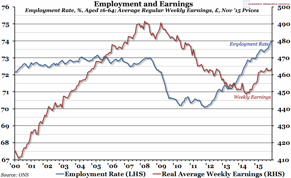
Summary: Labour market statistics were released today, and they showed another record high employment rate (74%). However, after a good 2014, earnings growth slowed considerably in 2015 (even in real terms, with inflation around 0% all year).
What does the chart show? This week's chart shows both employment and earnings. The blue line, measured against the left hand axis, shows the percentage of the population aged between 16 and 64 who were in employment over the preceding three months. The red line, measured against the right hand axis in pounds, shows the average weekly earnings (reported monthly) adjusted for inflation (so they are in today's prices), excluding bonuses and arrears.
Why is the chart interesting? Today's report from the Office for National Statistics shows that an all-time record number of people were employed in the UK in November 2015. As the population continues to grow, this is not particularly surprising. However, the employment rate (shown above) is also at a record high, which is a more impressive achievement, as it represents a proportion of that growing population. The rate for November was 74%, a full percentage point above the pre-crisis normal of around 73%.
However, the earnings picture is much bleaker. Nominal year-on-year earnings growth recovered to almost 3% over the Summer of 2015, but as you can see from the graph, this is mainly due to a growth spurt in 2014; between January and November 2015, real earnings only grew by 0.7%. The labour market is going to need another period like late 2014, otherwise real earnings growth could drop back into negative territory this year (particularly if inflation starts to pick up again). In this respect, the labour market is still a far cry from the pre-crisis period, when real earnings grew by almost 20% between 2000 and 2008.
 Post a Comment