


Week 32, 2015: UK Real Earnings Growth
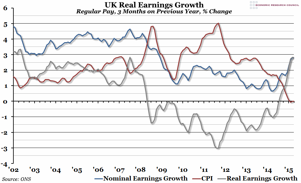
Summary: The labour market statistics released this morning showed regular average earnings (excluding bonuses) growing by 2.8% in the second quarter of the year (compared to Q2 2014). This was roughly the same as the growth in the period from March to May, and this represents the first time that real earnings growth has been at this level for more than a single consecutive three month period since 2002.
What does the chart show? The blue line represents the percentage change in the 3 month nominal average weekly earnings (excluding bonuses) compared to the same 3 months the previous year. The red line shows the percentage change in the CPI measure of inflation, also averaged over 3 months and compared to the same 3 month period in the previous year. The grey line shows real earnings growth: that is, the nominal earnings growth rate, compared to the same three month period in the previous year, after removing the effect of inflation.
Why is the chart interesting? Although the spectacular fall in unemployment that we've seen in recent years now seems to have come to an end (at least temporarily), there was still good news in today's labour market statistics. Annual earnings grew by 2.8% for the second three-month period in a row, which represents the highest nominal growth rate since the beginning of the financial crisis. Although this is still below the long-term pre-crisis average (which is around 4%), with inflation basically non-existent at the moment, this represents strong earnings growth in real terms. In fact, apart from a single three-month period in the middle of 2007, this represents the highest real earnings growth since 2002.
 Post a Comment