


Week 7, 2015: Earnings vs. Prices
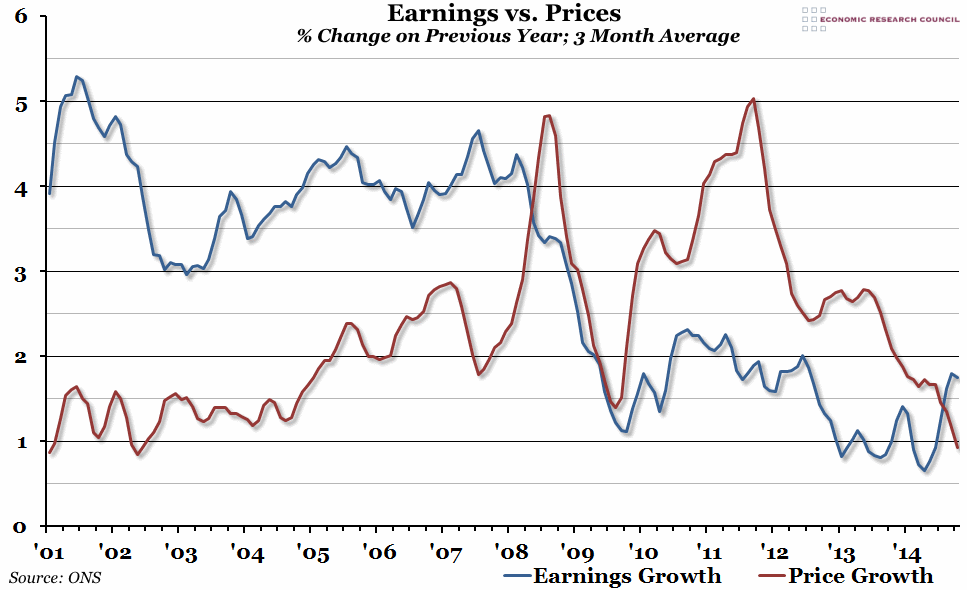
Summary: This week we've received two big bits of economic news: CPI inflation fell to just 0.3% in January, while earnings growth remained roughly steady at 1.7% in the three months to December. This means that we are likely to see a fourth consecutive month of real earnings growth in January, although we are still a long way from the pre-crisis normal.
What does the chart show? The blue line represents the percentage change in the 3 month average weekly earnings (excluding bonuses) compared to the same 3 months the previous year. The red line shows the percentage change in the CPI measure of inflation, also averaged over 3 months and compared to the same 3 month period in the previous year.
Why is the chart interesting? The financial crisis prompted the biggest contraction in real wages for at least 150 years in the UK, but in the last few months we've started to see earnings growth overtake inflation for the first time since 2008. This is obviously very promising news, and although there is still a long way to go until real earnings regain their previous peak, as workers feel better off this will hopefully feed through into the rest of the economy. It is worth pointing out that this real earnings growth has been largely as a result of exceptionally low inflation, rather than particularly strong wage rises. The pre-crisis norm was roughly 4% annual wage growth, which dropped to 2% between 2009 and 2012, and then again to 1% after that. The recovery in earnings growth we've seen recently has been back to that 2009-12, rather than the pre-crisis, level. However, in the short term at least, most people won't mind where the real pay rise comes from.
 Post a Comment