


Week 21, 2015: UK Regional Disposable Income
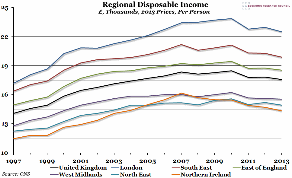
Summary: This morning, the ONS released a long-term data series on regional household gross disposable income, which showed that the gap between the richest and poorest regions in the UK had opened up slightly.
What does the chart show? The chart shows the per capita gross household disposable income (that is, income for households and non-profit making institutions serving households, after taxes and benefits have been paid), in thousands of pounds, inflation adjusted to reflect 2013 price levels. The black line is the total for the whole of the UK, and the other lines represent a selection of regions within the UK.
Why is the chart interesting? The most obvious point about regional inequality is that the ranking of the different regions hasn't changed much (if at all) over the last fifteen years (and probably longer). In fact, only Northern Ireland has shifted around, briefly overtaking the North East of England and even the West Midlands briefly before dropping back to being the poorest region of the UK. However, even if the order hasn't changed, the gap between the richest (London) and the poorest (Northern Ireland) has opened up since 1997. That gap actually peaked in 2008 (the end of the boom years), and has stayed fairly steady since then.
The second point that this graph makes clear is that, in real per capita terms, household disposable income peaked (for most of the country) in 2010 and then fell until 2013. The two exceptions are the South East of England and Northern Ireland, where disposable incomes peaked earlier, in 2007. This decline in household disposable income, which essentially represents the amount of money individuals have available to spend or save, helps explain the poor performance of the UK economy until 2013.
 Post a Comment