


Week 44, 2015: UK Household Finances
Summary: On Monday, the Office for National Statistics issued a revised measure of both real household disposable income and the household saving ratio, which made them seem worse than previously thought. We compare the measures in this week's chart.
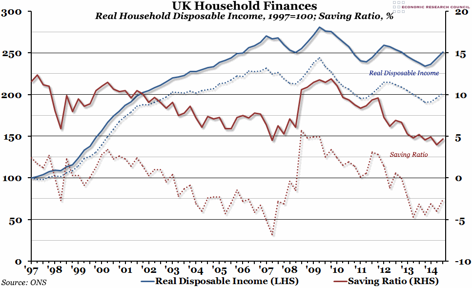
What does the chart show? The chart shows Real Household Disposable Income (in blue, measured against the left hand axis) and the Savings Ratio (in red, measured against the right hand axis), with the official figures represented by the solid lines, and the new figures represented by the dotted lines. More detail on the differences between the old and new figures is included below. The real household disposable income figure is an index of the real purchasing power of households (all income including social benefits and net property income, less taxes on income and wealth, adjusted for inflation), where the final quarter of 1997 is equal to 100. The saving ratio is gross household savings (the difference between total household income and all consumption on goods and services) as a percentage of total disposable income.
Why is the chart interesting? The new figures produced by the ONS this week have come about as a result of an attempt to produce more realistic figures that represent more accurately what households in the UK have been experiencing. The official measurements of disposable income have previously included elements that make sense from a national accounting perspective, but that aren't really felt by real households, and the new figures represented by the dotted lines above have removed these. For example, the official statistics include an "imputed rent", which tries to capture the value that owner-occupiers receive from their homes by adding what they would have had to pay in rent to their theoretical income. Although this benefit is felt by the home-owners, it is not money they ever actually see, and does not therefore impact on their spending decisions or necessarily affect how well-off they feel. The new methodology removes imputed rent, as well as other non-cash elements, from the figures.
The effect is that real household disposable income is much lower than previously thought (two times the 1997 figure, rather than two and a half times), more on a par with 2002 levels than 2006 levels. The implications for the saving ratio are even more stark: despite going up significantly in the immediate aftermath of the financial crisis, they have been negative since 2012/13 (the beginning of the strong recovery in the UK), implying that households are either running down previous savings or are taking on more borrowing to fund consumption.
 Post a Comment