


Week 8, 2016: UK Income Distribution
Summary: The Office for National Statistics released a report yesterday on household income for the financial year 2014/15. Although it showed that the overall income distribution hadn't changed since the previous year, it did contain some interesting information on the effects of redistribution.
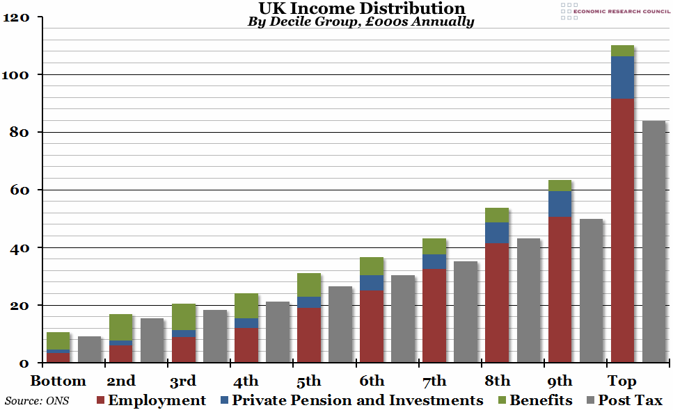
What does the chart show? The chart shows the UK income distribution, both before and after tax. Each pair of bars represents a different decile (or 10%) of all households in the UK, ordered by income from the poorest on the left to the richest on the right. Within each decile, the left hand bar shows pre-tax income in thousands of pounds, broken down into employment income (red), income from private pensions and investments (blue), and government cash and imputed benefits (green). Imputed benefits are an estimation of the value received by free services provided by the government, such as the NHS. The grey bars on the right hand side show household disposable income (after taxes have been paid). Essentially, the red and blue bars taken together are income before government involvement, while the grey bars show the effects of redistribution.
Why is the chart interesting? The effect of government redistribution of income makes up to 60% of households better off than they would otherwise be (although the 6th decile of households is, on average, only £94 better off). In relative terms, it is the bottom decile who receive the most help (as you'd expect), doubling their private income. However, it is actually the 2nd decile who benefit the most in absolute terms, ending up with (on average) £7,549 more than they would otherwise have. This is due to a strange characteristic of the current tax and benefit system, which means that while generally the proportion of tax paid to gross income goes up from 10% in the 2nd decile to 24% in the top decile, it is actually 13% for the bottom income group (higher than for the 2nd, 3rd, and 4th deciles). Although the system generally does a good job of flattening out the income curve slightly, there is a distortion at the bottom end as the poorest 10% are hit disproportionately hard.
As you can see from the chart, benefits are received across the board, but their profile is different depending on income group. Across all groups, the largest contributor is the state pension, although this is particularly noticeable in the middle income range. At the lower end, the other big payments are tax credits and housing benefits - essentially payments that top up shortfalls in employment income. At the upper end, the more important benefits are maternity pay, disability living allowance, and student support.
 Post a Comment