Week 30, 2016: UK GDP Per Capita
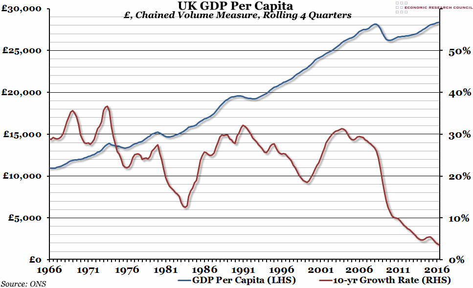
Summary: The preliminary estimate for GDP growth in the second quarter of 2016 was 0.6%, slightly higher than in the first quarter of the year. However, on a GDP per capita basis, the ten-year growth rate has fallen to the lowest level in at least fifty years.
What does the chart show? The blue line (measured against the left hand axis) shows gross domestic product (GDP), adjusted for inflation using the chained volume measure and divided by the average estimated population in each year (according to the ONS) to get a per capita figure, on a rolling four-quarterly basis. The red line (measured against the right hand axis) shows the growth rate over the previous ten years.
Why is the chart interesting? Roughly a year ago, total GDP per capita finally overtook its pre-crisis peak after one of the worst economic recoveries on record. This is obviously good news, but in the context of the past fifty years, this is beginning to look increasingly like a lost decade. Up until the crisis hit in 2008, it was common for per person GDP to grow in the region of 20%-30% every ten years. There were a few growth spurts where it grew faster than 30% (reaching 35.6% in the decade to Q1 1969), and there was a slow period in the early 1980s when the growth rate fell as low as 12.6%, but for the most part it stayed within that range. However, in 2011 the ten year rate dropped below 10% for the first time, and despite a recovery in headline GDP growth since then, the ten-year per capita rate continues to fall. In the second quarter of 2016, it reached a new record low of 3.7% - a remarkably low growth figure over a whole decade.


 Wednesday, July 27, 2016 at 12:18PM