


Week 2, 2017: China and India Historical GDP Growth
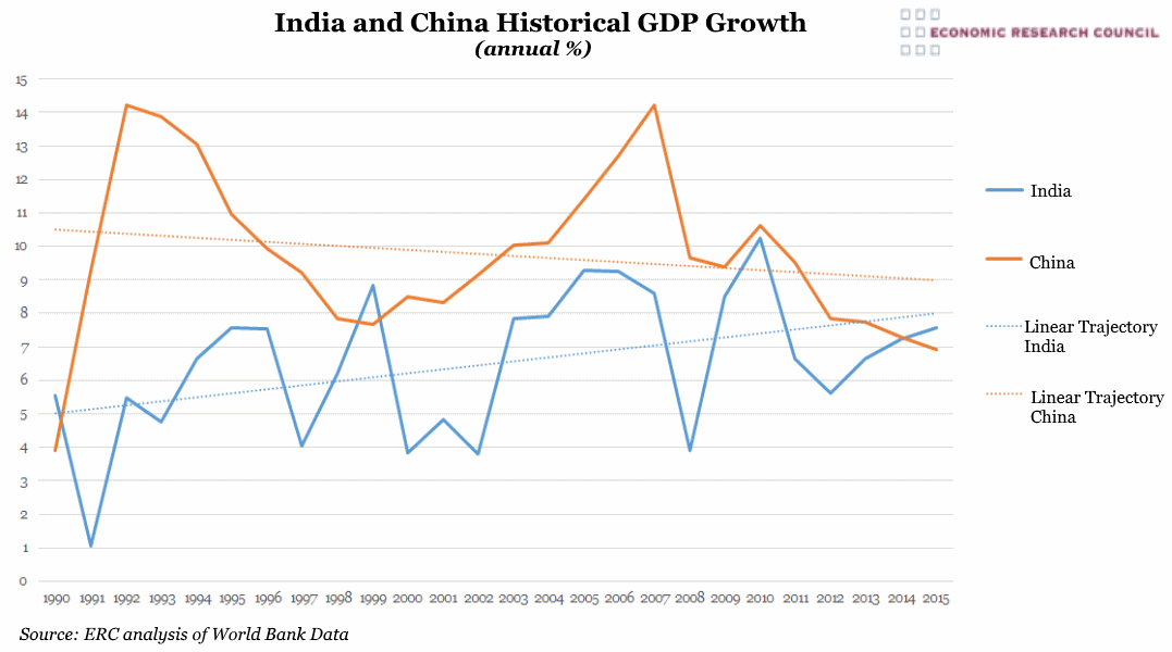
Summary: The chart shows that China and India, the world’s two most populous nations, have enjoyed dramatic positive growth over the past 25 years. Moreover as this chart indicates, Indian growth is on the rise while Chinese growth is slowing down. The chart raises several of the world’s most interesting macroeconomic questions: Why is the Chinese economy slowing down and will China be able to sustain its ‘economic miracle’? Is high Indian growth sustainable? What is the true potential of the Indian economy, and will India be able to become an economic superpower on the scale that China has achieved through decades of incredible economic growth?
What does the chart show? The orange line displays Chinese GDP growth, the blue line Indian GDP growth. The data is from 1990 and is the annual percentage growth.
Why is the chart interesting? Since initiating economic reforms under Deng Xiaoping in 1978, China has grown to become the world’s largest economy ahead of all other nations but the United States. India’s reforms came later but the country has now joined the world’s top ten economies, and, by some estimates, surpassed UK GDP in 2016.
What is the nature of the relationship between these two neighbouring countries, and how might the rise of Indian growth and slowing of Chinese growth affect their relationship with one another and with the wider world?
If this chart leaves you intrigued and keen to learn more about both economies, their history and geopolitics, then why not join us for our event next Wednesday? China and India expert, Dr Jonathan Ward, will unpack these trends further and answer your burning questions! More information can be found here.
 Post a Comment