


Week 45, 2016: US GDP and Unemployment
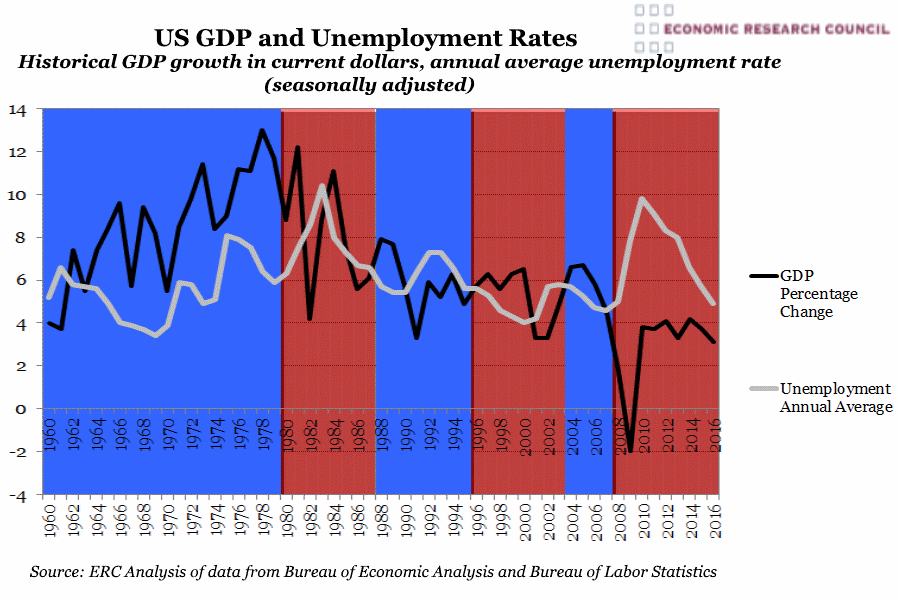
Summary: The chart shows that with the exception of 2 occasions, each time the incumbent was ousted at general election, GDP had fallen in the year prior. Excluding 1976, whenever unemployment has been falling or stable, the incumbent was reelected.
What does the chart show? The blue and red on this chart denote republican and democratic rule respectively and form the background for some salient information on the US economy. The grey line displays the annual average unemployment rate which has been seasonally adjusted. The black line shows historical GDP percentage change calculated in today’s dollars. The data begins in 1960 and end in Q3 2016.
Why is the chart interesting? In 1968 and 1980 when the aforementioned trend in GDP did not hold, it was due to political factors coming to the fore. 1968 saw Martin Luther King assassinated and precipitated Nixon’s extreme ‘Law and Order’ campaign success. However in 1980, which brought the Iranian hostage crisis, the US had experienced a number of years prior of poor performance economically and Reagan’s ousting of Jimmy Carter from office. Looking at 2016, Obama's 8 years in government are the only two consecutive terms that GDP growth did not surpass 5% and the unemployment rate did not tangibly improve. This and the widespread anti-immigration sentiment stoked, but by no means instigated by Trump, fits this same pattern of a lurch to the right in the public mood.
 Post a Comment