


Week 49, 2012: Average Household Finances
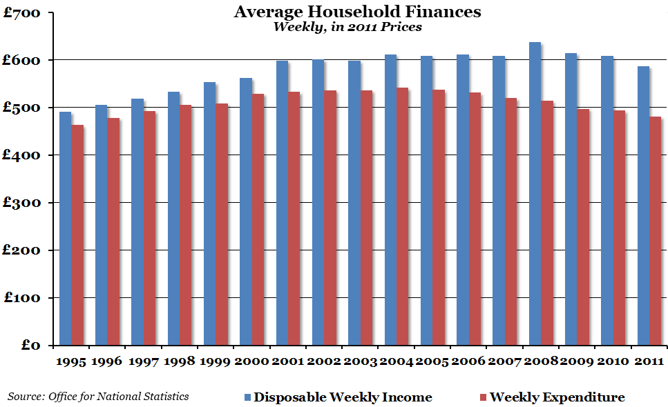
Summary: Figures released yesterday by the ONS showed that real average weekly household expenditure in 2011 was at its lowest point since 1996. However, the gap between income and expenditure is a lot higher now than it was then.
What does the chart show? The blue lines show the average disposable weekly income (income after tax) per household in the UK, adjusted using the RPI All Items index to be in 2011 prices. The red lines show average weekly household expenditure, again adjusted for inflation.
Why is the chart interesting? Average weekly household income has been falling since its peak in 2008, and it is now in between 2000 and 2001 levels. Expenditure, on the other hand, has been falling for a lot longer - it peaked in 2004, although it has been falling at a slower pace. We are now at a point where both expenditure and disposable income are at their lowest levels for a long time, but the gap between income and expenditure is larger than at any point in the 1990s and the first half of the 2000s.
 Post a Comment