


Week 24, 2015: Employment and Earnings
Summary: After peaking at a new record level in March, total employment levels fell very slightly in April (but the trajectory remains promising), while real earnings have recovered somewhat in the last year.
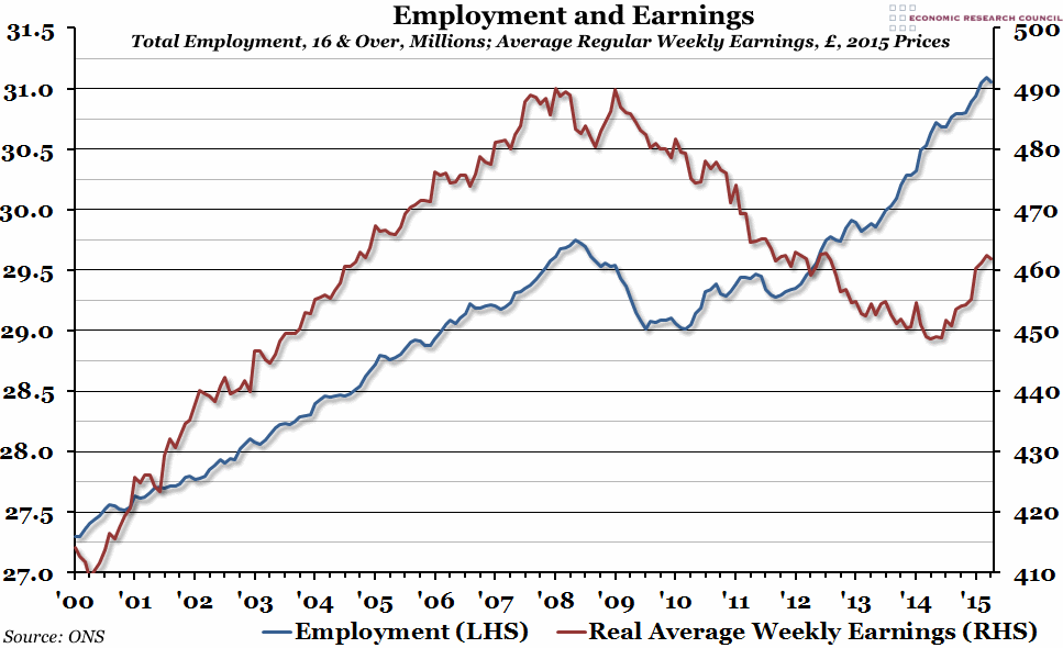
What does the chart show? This week's chart shows both employment and earnings. The blue line, measured against the left hand axis in millions of people, shows the total number of people aged 16 and over in employment over the preceding three months. The red line, measured against the right hand axis in pounds, shows the average weekly earnings (reported monthly) adjusted for inflation (so they are in today's prices), excluding bonuses and arrears.
Why is the chart interesting? Employment growth since we passed the pre-crisis peak in late 2012 has been at a faster pace than before the crisis, leading to new employment records being set almost every month. Although the April figures were slightly worse than March, this is unlikely to be anything more than a temporary blip. Once employment reaches a certain level, however, it can't continue to increase beyond general population growth, so it will inevitably start to slow down again soon (and may have perhaps started to slow in 2014).
Real average earnings are still well below the peak in 2009 (by almost £30 per week), but they have been growing strongly since June last year. For most of the year, this has been driven by very low inflation rather than significant increases in nominal pay (general price levels were slightly lower in April than they were in June 2014). In the last couple of months, we have started to see nominal wage growth of more than 2%, which is promising. However, the pre-crisis average for nominal wage growth was closer to 4%, so there is still some way to go if we want real wages to keep up once inflation recovers to a more normal level later in the year.
 Post a Comment