


Week 6, 2013: Average Utility Bills
Summary: It was announced today that water bills in the UK will go up on average in 2013-14, so we take a look at the real price changes since 2001 of water, electricity and gas bills.
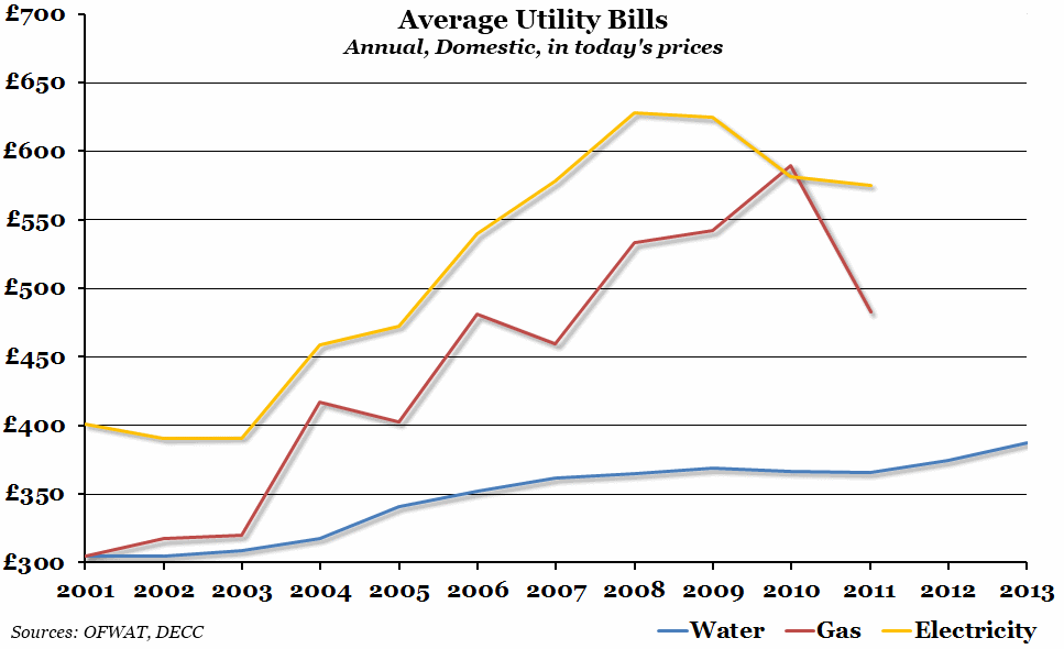
What does the chart show? The chart shows the real (adjusted for inflation) average annual bill for three different utilities - water (in blue), gas (in red) and electricity (in yellow). Water bill prices are set in advance by OFWAT, the UK water regulator, and average annual figures are released directly by them. For gas and electricity, the figures have been calculated by taking the total domestic expenditure on each, as announced by the Department for Energy and Climate Change (DECC), and dividing this by the number of households as estimated by the ONS (and then adjusting for inflation). Since water prices are set in advance, but gas and electricity bills are largely set by the market, data for water prices is available until 2013, compared to 2011 for the other two.
Why is the chart interesting? While water bills have risen in real terms since 2001, the increase is nothing compared to that of gas and electricity bills. The comparison between gas and water is particularly interesting: back in 2001, the average bill for water and gas was roughly the same. Although gas bills did fall in 2011, they are currently £120 higher on average than water bills, and at their peak were £220 higher. Meanwhile, the apparent decline in the cost of electricity between the peak in 2008 and 2011 was not a nominal fall in prices, but rather a below inflation increase.
 Post a Comment