


Friday
Jun082012
Week 23, 2012: At-Risk-of-Poverty Rates
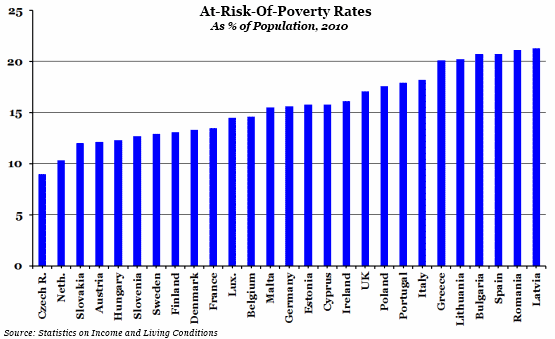
What does the chart show? The chart shows the at-risk-of-poverty rate for all 27 European Union countries in 2010. The at-risk-of-poverty rate is defined as the percentage of the total population with a disposable income (after social transfers such as income support, etc.) lower than the threshold of 60% of the national median disposable income.
Why is the chart interesting? It is alarming to see the difference across the EU - the at-risk-of-poverty rate in Latvia is over 12 percentage points higher than in the Czech Republic, for example. More specifically for the UK, it is disappointing to see that both France and Germany are below us in the list, and that our closest neighbour, the Republic of Ireland, is a whole percentage point lower.
It is important to note though that because the threshold used to define being at risk of poverty is based on each nation's median income (rather than a universal figure), "poverty" means a different thing for each country and is not an absolute measure of living standards. The at-risk-of-poverty rate is more helpful as an indicator of inequality than wealth. Nevertheless, it is an interesting economic comparison.
 Post a Comment