


Week 32, 2012: Olympic Medals
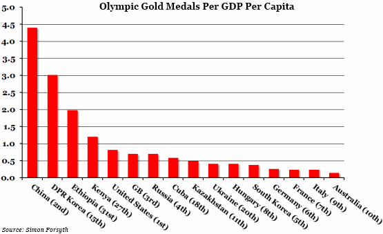
Summary: We've finally succumbed to the Olympic spirit and gone for a medal table. This one, compiled by Simon Forsyth on his website here, shows gold medals adjusted by GDP per capita (correct as of 11.30am on the 10th August).
What does the chart show? The red bars show the number of gold medals won by each country, adjusted for GDP per capita (so, in general, if you have either a high number of gold medals, or a low GDP per capita, you will do well in this measure). The number in brackets after the country names is their current position in the regular medal table. We have included the current top ten in the regular medal table, as well as some other high performers in the adjusted medal table.
Why is the chart interesting? There have been plenty of predictions from economists on how many medals each country will win based on various economic factors. This chart attempts to bear those economic factors in mind when considering relative olympic performances. China is doing exceptionally well. The USA and Great Britain are both also near the top of the list because they have a lot of gold medals. Other countries, such as North Korea, Ethiopia and Kenya, are doing well because they have managed to win a few golds despite their relatively low GDP per capita. This is impressive because, as Simon Forsyth puts it on his website, "the bigger your economy per person of population, the better chance your country might have finding and training a freak of nature that can win a medal".
And some countries, such as Australia, are just not doing very well at all.
 Post a Comment