


Week 2, 2013: UK Average Income Growth
Summary: The news in the UK this week has been mainly focused on the proposed 1% cap on benefit increases. At Prime Minister's Questions today, David Cameron said that over the past five years, benefit payments have increased by 20%, while average earnings have only increased by 10%. We investigate that claim with this week's chart.
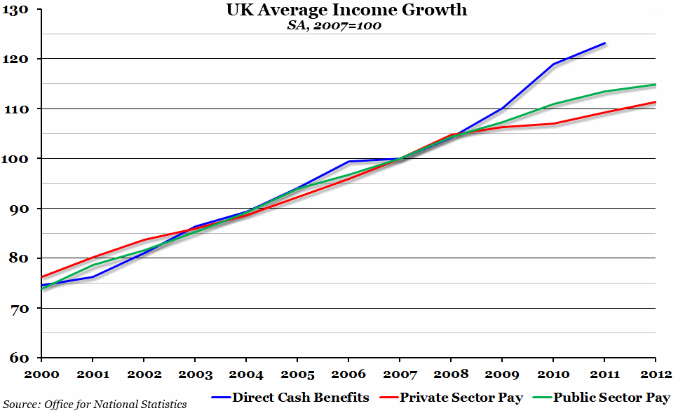
What does the chart show? This chart shows an index of three different things, all of which have been rebased so that their value in 2007 is equal to 100. The blue line is an index of the average annual direct cash benefits paid to the "average" household. The red and green lines show the index of the average weekly earnings for the private and public sectors respectively in April of each indicated year.
Why is the chart interesting? Although the data for benefit payments in 2012 isn't available yet, it is clear that the Prime Minister's claim is mostly true; there has been a large discrepancy over the past five or so years between growth in benefit payments and average earnings. It appears from the chart that this divergence began around the time of the 2008 financial crisis. A simple explanation is that as a result of the recession, pay levels were largely frozen and more people were forced into claiming benefits (either through Job Seeker's Allowance or income support).
However, not all of this increase has benefitted the so-called "scroungers": direct cash benefits paid to the richest 20% of households increased by over 30% between 2008 and 2011. For the poorest 20%, it increased by just less than 10%.
 Post a Comment