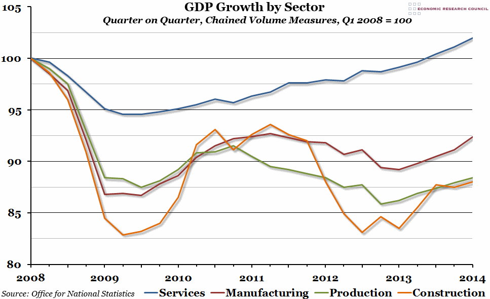
Week 22, 2014: UK GDP Growth by Sector
Summary: When the second estimate of Q1 GDP was released at the end of last week, the preliminary growth rate of 0.8% remained unchanged. This made for a rather boring update to our economic forecasting competition, but there were some interesting statistics in the ONS report, including this breakdown of growth by sector.
What does the chart show? The chart shows how output of the three main sectors making up the economy has changed since the peak of GDP at the beginning of 2008, indexed so that a value of 100 represents the output at that peak. The blue line shows the services sector (which is the biggest sector in the UK in employment terms), the green line the production sector (a subset of which is manufacturing, represented here by the blue line due to significant differences from the rest of the production sector), and the orange line the construction sector.
Why is the chart interesting? Although the economy as a whole has not yet recovered to its former peak, the services sector has (it did so towards the end of last year). It was also the only sector that did not experience a double-dip recession during 2011-12. Far from recovering back to their levels of output in Q1 2008, all the others have so far not even recovered to their "peak" before the second of the two dips. Manufacturing is closest, and will probably do so next quarter if all goes well. For the rest of the production sector, and for construction, there is a long way to go yet before even that relatively minor landmark is reached.
 Wednesday, May 28, 2014 at 12:17PM |
  Post a Comment
  Construction,
  GDP,
GDP,  Manufacturing,
  Production,
  Sectors,
  Services


