


Friday
Feb242012
Week 8, 2012: Business Investment
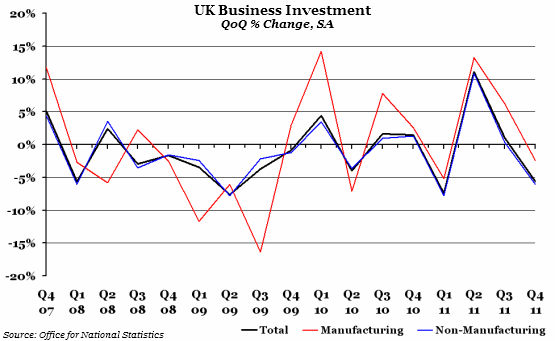
What does the chart show? The black line represents the seasonally adjusted percentage change on the previous quarter of private sector business investment (or the total inflation-adjusted value of capital investment). The red and blue lines separate out companies in the manufacturing and non-manufacturing sectors respectively.
Why is the chart interesting? After a 1% increase in the third quarter of 2011, most estimates for Q4 were for no growth, or a very small decline. The provisional figure, released today, of -5.6% is a disappointment, and is only the fourth time in four years that investment has dipped below -5%.
As you can see from the chart, investment in the manufacturing sector appears to be much more volatile and, for the past two years at least, stronger. This is mainly due to the fact that investment in manufacturing companies is at a much lower level, so growth is easier to maintain.
 Post a Comment