


Friday
Apr082011
Week 14, 2011: UK GDP, Inflation and Interest Rates
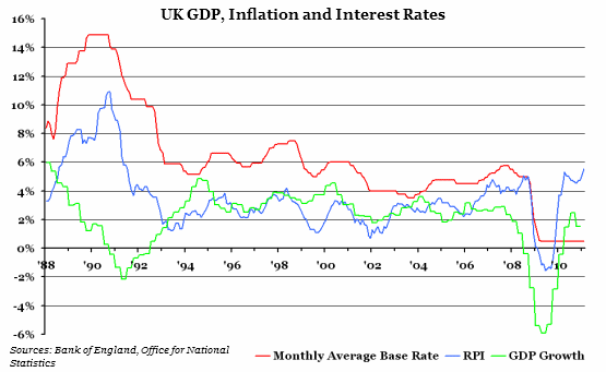
What does the chart show? The red line shows the base interest rate, set by the independent Bank of England every month since 1997. This is the interest rate that commercial banks can make short term loans from the central bank, and has an effect on the interest rates they pass on to consumers. The blue line is the yearly change in the Retail Price Index (RPI) - a measure of inflation. The green line is the yearly change in the Gross Domestic Product (GDP) of the economy, and is a general measure of output.
Why is the chart interesting? When the Monetary Policy Committee of the Bank of England decides on the interest rate for the coming month, their primary target is to keep inflation down (to 2% by the slightly different CPI measure - about 2.5% in RPI terms). Higher interest rates tend to have a deflationary effect, while lower interest rates encourage inflation. However, they also have to bear in mind the wider effect any change in interest rates will have on the economy; lower interest rates make it cheaper to borrow money, encouraging growth, and vice versa.
The difficulty the MPC is facing is that, for the first time since 1993, GDP growth and inflation are starting to diverge. By keeping the base rate down at 0.5% (the lowest they are ever likely to set it), they are choosing to prioritise growth over keeping inflation in check, for fear of plunging the economy into a second recession.
 Post a Comment